When I first started this course, I had absolutely no idea on how to animate or even begin to animate. I had come from an illustration background with an obsession of animation, games and comics, and I wanted to aim to make my animation cut scenes for games and create character designs. I remember the proud feeling I got when I made my first ever animation, Surprise!, I had difficulty with animating in photoshop, I couldn't get my head around the timeline panel, so I just used the frame by frame panel to animate with. I really enjoyed making such a short story, focusing on character designs and how to get the storytelling across in an interesting manner with the time that was available. The more I animated the more I became comfortable with animating in photoshop and learning new animating packages, like after effects and Maya. I found my love for storyboards, near the end of first year and continued this passion for storyboards through second and third year.
During third year I set out to be extremely ambitious, expanding my knowledge of film theory and creating a short concept, character design, background design and storyboards for my practical to show the skills that I had learnt from this, and made my own pilot episode from scratch. I made everything from the concept to storyboards to character designs to animating and editing, and I collaborated with a student from Leeds College of Music for my music score and worked with the voice actor from second year collaborative animation, A History of Cake. By animating on this project, I found my love for animation again, and I want to continue animating alongside storyboarding and character/background design.
By researching into industry through this module with support from tutors, I feel confident about applying for jobs and working in the industry, building up my social presence and applying for MA courses. Thanks to this course I have learnt invaluable skills and techniques towards my practice that I can confidently take into the animation industry.
After creating a portfolio last year I knew immediately what I wanted to improve on with the layout. For example in my 2015 portfolio, I had included a few storyboards from A History of Cake animation which looked nice but clashed with the black background pages. I felt that this element could be improved by deleting the white background of the storyboards and making the text white so that it stood out of the page, making it more legible for the viewer to read. I believe that this will look more professional and work with the rest of the content. I felt that this approach would also be needed on the following character design pages as the block white colour pages just clashed too much with the black background. I also felt that there needed to be more content in the art book, not pages but different pieces of work that I had done
I wanted my new portfolio to be jam packed with my COP3 storyboards, Character designs from Becky's Extended animation - Rumpelstiltskin, backgrounds and screenshots from my Extended animation. I wanted to adapt the t-shirt designs I made for qwertee as they were in a different illustrative style in comparison to the rest of the work that I want to include in my portfolio. I mainly just added a circular sky background behind the Kiki design and edited the halftone shading on the Dandy design. I purposely didn't add the character turnarounds and expression sheets from my pilot animation as I didn't want my portfolio to have too much of the same project. I wanted a range of styles from different projects to be shown.
Using my 2015 critique on the layout, I edited my latest portfolio, giving the white background designs a transparent background. This worked wonderfully, it had a lovely aesthetic and the text, even though white out was still legible for the viewer. I also edited the cover of the portfolio to match with the art book, dvd booklet and business cards, so that their was a nice link across all of my work.
Lastly I added my social media links to the back page. I included a link that I haven't talked about yet, Dribbble. Dribble is a site that slightly appears like Behance however the structure is completely different as you are able to search for pieces of work within a certain pantone colour, search for companies and hire them if needed. However I am still very confused about the site, I'm not 100% sure on how to submit work onto the site. Even though I am having this difficultly I still wanted to include this link for the future.
Overall I am very proud of my portfolio I am confident with all of the work that I have included and I personally believe that the layout of the portfolio has a professional aesthetic. I cannot wait to show my portfolio and showreel to potential job opportunities and at studio visits.
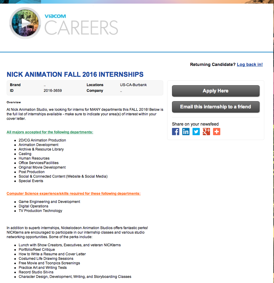
The Nickelodeon Fall internship allows you to have the opportunity to work with a range of departments, such as the 2D/CG Animation Production and Animation Development Departments. I am very eager to apply for this internship. I think it would be an absolutely amazing experience to be able to work in the studio and learn key skills from the animators. However even though the course starts this Fall, I couldn't find a deadline for applications anywhere. At first I thought that if you began to apply it would tell you the deadline but there was no indication at all. I think it would be wise to submit my application as soon as possible to ensure that I do not miss the deadline.
I will of course have to consider, if I am accepted, obtaining a working visa, travel expenses, accommodation and other living expenses. I will most likely have to get another job at the same time as the internship, so I would want to ideally move to america a month before the internship starts to acquire a job that I could work alongside the internship. This is all speculative.
I know that there is another internship near the beginning of the year that focuses more of the pre production side of the industry, however I unfortunately couldn't find any spaces available or any where to apply, so I will be keeping an eye on the site to ensure that I don't miss the deadline for the following year.
Unfortunately I couldn't find any internships that would aid my practice, there were quite a few within the production and post production internships, which would at least get my foot in the door, however I can't justify the expense for traveling over there, cost of living and accommodation to do something which I wouldn't have a passion for. I do know however that another batch of internships will be available nearer November, in which I will be keeping a close eye on as I would love to take the storyboarding internship that they have.
I did however find a few jobs that I am very keen in applying for, Storyboard Artist and Background Painters/Designers. Here are my notes on these roles:
Storyboard Artist:
+ Require collaboration skills with department heads for critique on work, problems and schedules. I believe that I can professionally achieve this as I have collaborated with fellow students, musicians and voice actors throughout my time on the course, where I have brought everyones ideas together to create an innovative animated piece and managed the production line efficiently.
+ Pitching - I have had experience of pitching my ideas through the Responsive module and Extended modules, where I would have to present a short but sweet run through of the work and decisions that I have gone through to come to my final solution.
+ To ensure that the style is consistent. I believe I have shown this throughout all the storyboards that I have submitted so far, especially through the COP3 storyboards.
+ The role requires knowledge of storyboarding software, it doesn't state what software but I have a inkling that it would most likely be Toon Boom Storyboard Pro, which I have some knowledge of but I am not confident enough with the workspace. This can be easily solved by having a solid few days just using the software and following tutorials until I am comfortable with the program.
+ Requires knowledge of using cintiqs and photoshop - I currently have my own cinitq which has aided the growth of my practice as well as expert knowledge in photoshop.
+ The only requirement that I would be struggling with is the 2-3 years of storyboard experience however it does say or equivalent combination of education and experience - I believe that my time visiting Arcus and my time on this course would be more efficient for this requirement.
Storyboard Artist
Background Painters/Designers:
+ I was intrigued by this role as, when making my final major project, I adored making the backgrounds. It was so much fun redrawing the same background but from different and dynamic angles that helped to influence the frames composition and narrative.
+ It is clear from the job description that I don''t have enough expertise in the field, I was just curious about what the job required, as the role asked to make colour guides and floor plans which I don't have any experience in. However following my 12 month plan, learning about these elements would help to develop my practice as I am positive that creating colour guides, or something similar, will be specified in the role of a Character Designer.
+ To be able to review storyboards and scripts - I have experience through reviewing my own work and fellow students work in order to make a more innovative piece.
+ Interestingly, in comparison to the Storyboard Artist role, there is no requirement for experience in industry.
+ I don' think that this would be a job that I would apply for yet, not until I have built on top of the skills that I already have, however I will continue to research job requirements in order to inform my own practice.
Whilst at my career coach session, I was thinking about taking an MA course, however I didn't know whether or not to go ahead with this as I wasn't sure myself if I wanted to take my final major project further or start another project for the MA. I know that there are researched based MA's where you focus more on dissertations and theory, making a practical to go alongside it, with the other being taught and enhancing your skills as a practitioner.
Whilst looking for work experience positions on the Aardman studio website, I followed a link that took me to the National Film and Television School. NFTS offer amazing opportunities, ranging from short courses, Diplomas and Masters. I eagerly looked at the MA courses that were available and found three that caught my interest, Directing Animation, Cinematography and Screenwriting.
Looking through the curriculums with all the courses, I know that the Directing Animation course would be the most beneficial with my practice as the course focuses on Storyboarding, creating characters, performance, script development leading to a dissertation and graduation film. The entry requirements for the Directing Animation course ask for a degree in animation, graphics, illustration or fine art. They also require a submission of an animation film that you have created onto a DVD with a max of 20mins, this would further include unto 5 mins of other work, not just simple exercises. I think this is quite interesting as it is almost like your showreel but they are asking for the full animations. Additionally they ask for a proposal form for a 1 minute animation project, and a portfolio of illustrations and drawings. The proposal form sounds interesting, as it asks for a new concept and synopsis, that hasn't been included on the disc. I think this is a fantastic way for the course to see the creativity and skills that each applicant already have.
Whilst talking to one of my tutors, they recommended another site called Rain Dance who offer a postgraduate film degree where you make films and work with industry. I feel that this course would be beneficial for making important connections to the film industry however the curriculum didn't seem to be beneficial for my practice in comparison to the Directing Animation course.
The more I research into this aspect of taking an MA, the more it makes me want to go for it, especially with the new funding and scholarships that are available for this year and 2017. I still need to research more into this, going to a few open days at universities that do Animation MA's so that I can weigh the pros and cons of each course with how it will benefit me. As I am visiting London quite soon, either the end of June or July, I want to start visiting Animation MA's by going to the Royal College of Arts and looking at the course studio space, curriculum, talk to the tutors and peoples work, etc. I have added this to my 12 month plan and I have come to a decision to take a year out to build up my experience, practice and network with other practitioners before I go for the MA.
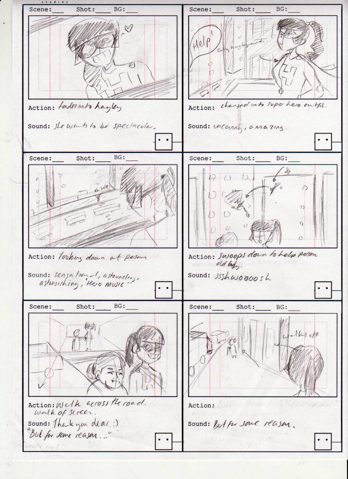
Having learnt so much about composition and film theory in COP3, I wanted to apply these new skills towards my practical, simulated storyboards. I mainly wanted to edit the first 3 boards, which I redrew and redirected both the camera and the narration for these scenes. With my COP3 boards I added extra detail with lineart and a range of shading with the grey tones to make the light standout even more, but with these extra elements, it takes longer to create the boards and, when making storyboards in the industry, extra time isn't a luxury. For these sets of boards I wanted to experiment with the shading by using white as the main focus and light in the frame, and a few block shades of grey to determine the content in the background. I wanted to experiment with this technique to see if it would be a more efficient way to produce storyboards in the future. I also wanted to edit the narrative in the beginning frames, I wasn't too keen on how Hayley was introduced, it felt too motion graphic, which is not necessarily a bad thing I personally didn't think it would work with the rest of the camera direction, and I didn't like the narrative where Hayley walks an old woman across the road, it was dynamic enough to work with the narrative.
Example of COP3 Storyboards
Brief notes on each board:
+ Board 1 - changed the beginning of the narrative to show Hayley's morning breakfast routine, slowly showing the audience that she has super powers. Made use of the foreground being slightly out of focus to create more depth in the frame and show the focus shift to the main character of the narrative, Hayley.
- Third frame shows that she has powers, using them to make her morning breakfast. In the background the toaster rattles, showing that it will be the next focus in the following sequential frames. This frame is also the first to have some detail on the background - the first too frames not having too much of a background as to give more emphasis on the action. This frame helps to give the audience a setting, we know that Hayley is in the kitchen having breakfast.
- Following three frames show the toast flying from the toaster and being buttered - range of close up and long shots aid to clearly show the movement.
+ Board 2 - first frames shows a dynamic and interesting shot of the toast reaching Hayley, linking to the next shot where she is slowly eating it.
- the following two frames show Hayley reading the newspaper, shown through an over the shoulder shot as the camera pans into the newspaper, showing Hayley putting herself in the hero's shoes - I felt that the framing of the shot added a nicer transition to the next scene, adding to the narrative as it describes the elements that she wants to be; showing her dream.
- This board is quite simple in space and composition in the previous boards, in the first board I was able to take advantage of the amount of space, being able to use the russian formalist technique of the dominant and defamiliarization, presenting the chain of events in a different way in order to make the main action in the scene standout to the audience, regardless of the hierarchy in the primary planes.
+ Board 3
- first frame shows an over the shoulder shot of what Hayley is seeing, the camera panning into the burning building - revealing the source of the cry for help. I didn't make this shot a power angle as I felt that this would be better suited for a more dynamic action, for example when she arrives at the scene and lands in front of a crowd of worried citizens, or when she finally captures the bad guy, etc.
- Hayley flies towards him - using Hayley's fist as a transition to the next scene. I personally liked this as it made it more interesting of a shot - leading to the following scene.
- extreme close up of the name tag to a long shot of the next scene helps to build up anticipation of the following narrative.
The overall aesthetic for the storyboards works successfully for the motion graphic advert, I wanted to twist the visual style so that it was a merge between a motion graphic approach with added detail - mainly the addition of more detailed backgrounds and use of camera angles. This practical has aided the growth of my practice substantially as I have had a taste of what a client would need from a storyboard, commercial wise, and how the script is approached in industry - the layout and timing with the audio etc. At the beginning of these simulated boards, I wasn't sure were to start, I had only drawn storyboards for short animations, and the tone, spacing and aesthetic is completely different for commercial animations. There needs to be a clear path in the frame to show the subject of the narrative and scene. Regardless I really enjoyed this brief and want to keep using this brief as an experiment, in the future, to see what techniques I can get away within order to retell the narrative so that it still suits the target audience.
For the design of my showreel I wanted to keep the duration to 1 minute or under - I wanted to make sure that what I had in my showreel was quality rather than quantity; I will be sending this showreel into the industry, showing it to practitioners and animation studios, I need to ensure that the showreel shows the best of the best.
I used my ending title sequence from my Extended project for the opening and ending sequence in my showreel, I felt that this connection to my final major project worked successfully as the Extended animation was the big project that I spent alot of time on and I wanted to show off what I have done in my showreel.
At first I had two fonts for the opening sequence - a typewriter font and a medieval font from my Extended animation, but through peer feedback I used only one font as it clashed together; I kept the medieval esk font. I made sure that all the other marketing designs had the same layout with the font so that they all connected and looked aesthetically pleasing.
With the ending title sequence, I added all of the social media links that I have, adding icons of the sites to both add to the aesthetic and clearly show the audience what website it is. Unfortunately I couldn't just put my username next to the icon, personally I found that it not only looked strange but it was confusing as I couldn't tell a few of the sites through their icon and I wanted to ensure that it was easy for the audience to read and to understand. I also added the Leeds College of Art logo and my own logo that I made purely for my Extend animation; I felt that this was a nice addition, it made it look professional. Peer feedback additionally suggested to make the bags eye blink as something needed to happen with the bag, it was the only thing that was static in the sequence. I really liked this addition it worked well with the timing of the music score and made it more aesthetically pleasing.
For the music score I re-used part of the score that Daniel Chant-Burgess made for my Extended animation. I absolutely love the score that he made for me and I felt that it worked really well with my content in the showreel; I timed it well with movements in individual scenes.
My content for the showreel needed to be captivating, with a strong start and a strong finish. I knew I wanted to add my COP3 storyboards, quickly making them into an animatic, alongside my Extended animation however I wasn't sure what else to add in. I looked at the other work that I had done in third year and second year, I really liked my character designs that I made for Becky's animation Rumpelstiltskin, I felt that the best way to show this would be through showing a clip of her animation alongside one of my character designs. After adding these elements together I really liked the aesthetic, it worked well, I just need to make sure that I label each piece of work I show in the showreel so that viewers don't think that the stop motion is my work, as the sole ownership is Becky, only the character designs for Rumpelstiltskin and the Troll King are mine. I labeled these elements in a simple manner, a lower opacity box and a legible typeface, Calibri. I wanted these parts of the animation to be simple so that it didn't crowd the frame and detract the viewers attention way from the content of the showreel.
Additionally I added a clip from second year Food Mod animation, A History of Cake, I felt that this was an important part to add to my showreel. It was my first collaborative animation with fellow students, and I animated a few of the last scenes which I wanted to show off. I felt that this worked quite well in amongst the rest of the content that I had added in from my third year work, as it showed my lip syncing, colouring, editing and animating skills in the clip.
With my final major project animation I decided to use a clip that showed a simple movement but with lots of secondary animation. I felt that the best clip to show this is the medium close shot of Cy as he moves his head down slightly and frowns. I really like this scene, it is simple but it clearly shows the movement and emphasises the change of expression well.
I ended the animation on another clip from my Extend animation, the main dialogue scene where Dusk moves around Cy as he introduces himself and explains about the spyglass. I really liked how this was the ending scene as it shows my animation skills, lip syncing skills, editing and illustrative aesthetic. Feedback suggested that the audio of the lip sync scenes needed to be added as it shows an important skill of being able to match the audio with the lip sync. Unfortunately with the A History of Cake section, I wasn't able to find the original file that wasn't with the backing track of the original animation, so I had to leave the clip as it was.
Lastly, I uploaded my showreel to LinkedIn through Youtube, adding it to my summary. I wanted this to be on my LinkedIn profile so that practitioners and studios can look at the work I have done; promoting my work further.
During a tutorial with my tutor, he mentioned Motion North, which is a gathering of animators in Manchester, which occurs every so often. This is a fantastic local opportunity to meet up with animation industry practitioners and studios to talk about animation, hopefully showcasing some of my work for critique and ultimately promoting my work. The next meet up is in July which I will be attending, I am quite nervous but extremely excited.
Through joining the Motion North group, I had to sign up for a site called 'Meet Up' which is much like Eventbrite, which the university uses for Career Track Tuesdays and visiting professionals etc. There aren't as many local events on Meet Up in comparison to Event Brite however I did immediately find York events, which is quite near my home town. I will be attending these events in York as it will help to build up my confidence and my networking skills as a practitioner.
Near the end of June/July, I will be going to London to visit as many animation studios as I can, I want to get my name out there and build up contacts. Whilst in London I will hopefully be visiting the Royal College of Art to enquire about the MA course that they offer, and visit the National History Museum and the Saatchi and Saatchi Gallery. I will be contacting these studios as soon as the preparations for the end of year show begin.
In addition to visiting the studios I will be sending my CV to them, even though it would be a speculative application, there could be position and/or get feedback about my work and how to improve etc.
The main studios that I aim to visit are:
Blue Zoo
Blue Zoo
Blue Zoo have created multiple award winning animations, one of many animations they are known for is the series, Those Scurvy Rascals and have worked for other animations from Nickelodeon, and Cartoon Network, as well as commercial animations. They have won multiple BAFTA awards for their innovative and creative approaches to their work. I would love to visit this studio, even though the majority of the animations are 3D based, I would love to be apart of the design process. The storytelling for each project that they have taken all think outside of the box and they always add a distinct personal twist to the work.
Planet Jump
Planet Jump
Planet Jump have a range of animation skills that they incorporate into their work, ranging from traditional animation to roto-scope to 3D animation. They also specialise in pre-production work for clients and companies, ranging from storyboards to concepts. The studio both employ full time and freelancers. I found this website whilst I was on Twitter and fell in love with their Mirror Edge concept art and Madron animation. I loved the character design choices and camera direction that they used, and I could tell that they really enjoyed working on the project. The Madron animation used frame by frame animation, and I found that a few of the shots were repeated, not in the content or narrative just the framing - this is seen with the main characters reaction shots. There is nothing wrong with these shots, I felt that a few could be a power angle or changed to a medium shot with her slightly off the center of the screen. However having said this all the narrative choices and animation was done well and was aesthetically pleasing.
Studio AKA
Studio AKA
Studio AKA incorporate a range of animation techniques that have won them multiple BAFTA awards and Ocsar- nominations, for their quirky and innovative animations. The studios work ranges from commercials, children's animations and campaigns to raise awareness towards health and addition, such as the Meth Project. I loved the amount of dedication that was put into the Meth Project the concept art was beautiful and they carried out the serious tone of the campaign with a professional approach. I also adore their work on Stuck on a Sunday, I love the character and concept design for the project.
The Line
The Line
The Line is a group of 6 directors that create a range of productions, such as animation, games and music videos. There first short animation was BAFTA nominated, Everything I Can See From Here. The animation for this is absolutely beautiful, the character designs allow the animation to be more fluid and smooth which just looks stunning with the background designs. The narrative loops back quite well with the football, I really liked this addition, it made the animation quirky and added more light-heartedness to the piece.
They hire freelancers for different projects, so I will be sending a CV quite soon to see if there is any work going for one of the projects. They do have an internship program which I want to apply for next year as unfortunately I was too late in applying this year.
With all the work that I have created over the time I have been on this course, I wanted to bring all the design work into one printed outcome, an art book. I really want to make one for the end of year show, having a physical book with all my work just seems like the perfect way to tie everything together. In addition, I want to print this art book for both myself, my family and the end of the year show. At a tutorial, one of my tutors told me about Cafe Press and Print Cafe. Cafe Press allows you to customise anything from stationary to mugs, t-shirts and pillows, however when I looked at the journal printing, it is only a spiral bound book and you can only customise the cover. I wanted to make a full art book so I looked at the other site, Print Cafe. Print Cafe specialises in fine art and dissertation printing, the hard bound books looked gorgeous. When I went back to talk to my tutor about using this site, they said that it would probably be cheaper with buying more than one, like 10. It might seem more expensive but it would be cheaper per book. I could then go on to give art books to my family and studios that I visit. It would be something different and I definitely would leave an impression.
For the content of the art book, I am definitely adding my Merged Perspective boards from the COP3 module, with all the thumbnail designs and character sketches which would work successfully with the art book I recently made for the Extended Module, The Shadow of Cy. As both projects use the same characters it would be a nice addition to have these elements together.
I would have to make a new layout for this art book as both of the art books that I have done so far have completely different approaches and I want the final art book to be simple and tie in each element. With regards to layout, I want to contextualise each piece of work, or a page before the project, so that the spectator has more information on the project, the thoughts on decision making for certain design choices etc. I think this would be a nice addition to have alongside the rest of my work and marketing designs at the end of year show.
I will be making the art book during the preparation of the end of year show.
Having made a Tumblr page for my personal website, where I upload both finished works and working in progress, I was debating whether or not having my own domain would be more efficient, but I wasn't sure what the cost was and how I would achieve this.
My uncle, who has built his own websites for himself and other companies, told me that the domain name that I wanted would cost roughly £6 pound a year and hosting would be about £3 a month. I thought these prices were amazingly cheap and it is definitely something that I will start to build up during the preparation of the end of year show. My uncle said that a site called squarespace, even though it would be more expensive, have professional templates made for portfolios and gallery esk webpages. This would help me to build up a professional layout but at the same time I worry about the expense, realistically I don't know if I could afford it each month.
Alternatively I could create a wordpress page, they range from free to cheap hosting from 99p, which could be a good site to research more into, however I am more inclined to stay with my Tumblr site for now. I know the site, its easy to use and I can make it look professional. There is also the social side to Tumblr, it is easier to share art with international audiences. k
Naughty Dog is a games designer company who have created popular titles such as Crash Bandicoot, Jak and Daxter ,and The Last of Us. I absolutely adored the Jak and Daxter series, it is still one of my most favourite game series and has inspired me with both narrative and character design. I was intrigued with the requirements for the jobs at the company. From the few jobs that were available, the role of a Character Artist caught my eye. The requirements for this role were more inclined towards 3D packages which wouldn't be appropriate for my practice, however I wanted to take note of what skills I already know could be refined or developed further. I would like to try and learn the basics of Mudbox as I believe this would be a good skill set especially within the character design field; being able to turn your 2D designs into 3D is a good asset. Quite a few jobs that I have researched into, character design and background design based, have required some knowledge with sculpting in 3D packages.
I want to still submit my CV to Naughty Dog, even if it is just a speculative application, there could always be an opening in the near future which would be better suited for my practice.
I wanted to make a simple sticker sheet that would be aesthetically pleasing to the audience and further promote my Final Major Project. For my sticker sheet I mainly used lineart from the character turnaround and expression sheets. I added a spyglass as I felt it was a nice addition, with the shadow being released from it in the pilot episode. In addition I purposely made the sticker sheet A6, as it is better suited to the size of the stickers and less expensive to create in batches. I was a bit stuck with the layout, I wanted to jam pack in as much as I could but I didn't like the design so far.
Peers feedback told me that there were too many designs of the characters heads, there needed to be less, with different designs other than the two characters. I agreed with this feedback, I needed to narrow down the main designs that I wanted on the sheet as well as more space between the designs so it doesn't seem cluttered. I thought about the different designs that I could add to the sheet, and it made me think of the COP3 storyboards that I made featuring these characters. I wanted to use the background content in these storyboards as inspiration, the rows of cabinets that held skulls and treasure chests etc. I really liked this idea, it was another nice connection to the work that I have made.
Old Version
With this version, I took away some of the character heads and replaced them with a treasure chest, a knights helmet and a skull. Adding them to the layout of the sticker sheet and moving the title into the center of the sheet worked successfully. I really liked the layout, there was enough space around each item and it didn't seem too cluttered compared to the previous version. I went back for feedback from my peers, they really liked the design and added that the title could be a sticker as well, but with out the white outline as it wouldn't work with the stroke already on the text. I will definitely print a batch of these sheets out for the end of year show, I think it works well and is a lovely addition to the rest of the marketing designs.
Final Version
I wasn't too sure about making badges, I thought that it would be quite apt to have these alongside the sticker sheet. I do have a badge maker at home so it wouldn't be too difficult to make them, it would also be cost effective as some websites charge £3 just for one badge. I wanted my badges to be at least 30mm diameter. For the badges design I wanted something that looked fun and aesthetically pleasing to the viewer with close ups of the characters faces and the main image I have been using for the cover of my artbook, dvd booklet, business cards, portfolio etc. I wanted this to be a nice link to all of the designs. I enjoyed making the designs however I am still not entirely sure if I will make these for the end of year show, however I wanted to continue making the design just in case I do.
Peer feedback suggested that the imagery for the badges worked successfully but it felt like some of the designs were missing something. This could be fixed by adding the title of the animation on the curve of the badge, I believe this would work quite well, I could also add the spyglass for one of the designs or skull from the sticker sheet which would look quite nice with the rest of the badges.
I started to add the text to the designs - as I was using photoshop, I wasn't entirely sure how to make the text write onto a path as I first used the preset designs that move the text into an arc shape, etc, but this wasn't the effect that I wanted. I decided to make a marquee selection that was the same size as the badge outline, turning it into a path, and then attempting to type onto the path. This worked successfully and I was able to scale it down/rotate to suit the image. Overall I am very pleased with my designs for the badges, with adding a few extra variants, the skull and the knights helmet, I felt that it connected more with my pilot episode and other marketing material.
When I made business cards last year for the end of year show, I took a risk with having three different front designs with all of the text on the back; the risk being that my name wasn't on the front of the business card and it was just a design. However within the first few days of the show, the majority of the cards were gone. I was so incredibly pleased that so many people liked the designs and I wanted to continue this for this years exhibit.
This year I wanted the design to stay focused on my third year work and final major project as I personally felt that it was a nice connection with my marketing designs and artbook. I experimented with different possibilities for the front and the back design. With the front design I tried screenshots from my pilot episode and frames from my COP3 project which worked quite well but I knew it wouldn't be colourful enough for the audience to want to pick up, so I knew I had to focus more on the screenshots. I did experiment with adding in my drawn profile picture I made for LinkedIn and other social media, I thought that this would be a nice link to these elements however I personally didn't like it, I think it was the background as well as the vibrant red in my hair that put me off the design for my business card. I decided to focus on the main image of my characters that I have used across my work. When I placed the design into Illustrator, it was considerably bigger than the artboards and where the artboard outline was on the design, it only fitted Dusk's face. Even though this was coincidence, I really liked it. I tried this same close up approach with Cy's face and again it worked quite well.
Ideas on possible business card design
At first I struggled with the back design. I used the same layout as the previous business card designs that I made last year, changing the font and adding symbols next to the social media contacts. I haven't added my mobile number as I personally think that this isn't needed, the public use the internet more and are more interested with social media. I would also rather give my number out personally to people once they have given interest in my work and have contacted me through these social media. After considering the contact information, I found that the design looked boring. I wanted a small image or sketch to tie in the design. The first sketch that I imported just clicked with the work, I loved it, the contact details aligned perfectly with Cy's backpack and it made it more visually interesting.
Here are my final business card designs:
Front Design 1
Front Design 2
Front Design 3
Back for all of the business card designs
With peer review on my designs, I gained preference to only the 1st front design as it linked with the rest of my marketing and portfolio works. I completely agree with the feedback, however I wanted variant designs alongside the 1st final business card design, so I have decided to keep all of the front designs; I would add less of the variant designs so that the main front design stands out more. Another piece of feedback was the back of the design, having two different typefaces clashed too much so I changed all of the text to one font. as well as moving the twitter link and icon as the space was quite small in comparison to the rest of the spacing. Peer review also pointed out that I didn't have a 'Who am I' line. I completely forgot about this and added this element straight away, I made sure that this 'tagline' was the same with my portfolio cover. In addition my feedback suggested making the back of the design grey-scale so that when the design is sent to printing it would be less of an expense, as some companies do not print colour on the back or will for an additional fee.
Over all I am really pleased with my final designs and cannot wait to get them printed for the end of year show.
In order for my practice to grow I have to ensure that all of my social media is kept up to date which working in progress shots, projects I have completed, drawings that I have done that day etc, as well as ensuring that I keep up to date with the current animation events and changes in the industry. If I do go to straight to being a freelancer, I need to ensure that I keep all of these sites are getting daily updates to keep followers and potential job opportunities aware of the work that I am doing.
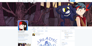
+ LinkedIn - I am recently new to this site, having had it for about a week, but I am so disappointed with myself that I didn't get one sooner. This site is fantastic with job alerts and connecting with animation studios, groups that relate to your practice, and potentially showing off your professional skills to the industry. I am really enjoying this site so far and hope to promote my work through this site. I still need to add a few skills and experiences to my profile, as well as post up working in progress screenshots and completed works.
+ Twitter - I have had this account for 3 years now and I have a few solid weeks were I remember to update every other day, but then I get distracted with coursework and forget to tweet or retweet work on my page. I also want to continue uploading work to the character design competition on twitter as it is updated weekly with different challenges and would be good to keep me drawing and having current work to upload. I have to get into the routine of updating this page as it is an amazing site that can promote my work worldwide and I need to take advantage of this to aid my practice.
+ Behance - This site isn't like the other social media sites, it is a collective of projects and portfolios, a professional site to upload your work and share with potential employers/ festivals. Its a great site to show at studio visits as I upload all the completed projects and portfolios that I have made so far. You can share the work for other people on the site to look at, to like and follow your work, but being honest I haven't had the time to build this up, which is why my work hasn't had that many views. A good way to build up these views is to create illustrations with popular themes or current trends to build up a following. I can merge this with my Twitter account, with working in progress shots and character design competitions.
+ Tumblr - I have being using Tumblr as my personal website, purely how simple the site is to share and upload work. I have being using it to show completed and working in progress work, which is great for showing at studio visits. I have debated about creating a wordpress site to upload my portfolio work, but I think this is something that I will look at in the near future as at the moment I really like my tumblr page, as it is simple.
For my end of year show I want to promote and show off my final major project, and what better way to do this than with a Cardboard Cutout!
I only researched into the local printing businesses so that if there was a problem with the printing, I could easily take it back to the company and fix the problem. I did however look into online printing companies such as vista print, which were not as expensive as I had originally thought, round about £40, but the problem here would be if the design was offset or printed in the wrong colour, it would be difficult to solve and return.
I looked into Hobs Reprographics, near the centre of Leeds who are highly rated and quite close. They have made quite a few cardboard cut outs however I don't think I would be able to obtain one for any cheaper than £40 if I am extremely lucky. Having made a prototype Cardboard Cut out in high school, I believe that the best course of action would be to obtain some foam board, about 3-4ft if possible, spray mount the design onto the board and use the laser cutter in woodwork to precisely cut out the design. Not only would this be less expensive it would most likely be quicker than sending the design out to be printed.
Cardboard cut out design, main stance from the animation.
Making vinyl stickers would be quite simple, as we have the resources at the college, however it all depends on the expense of the printing. I don't have to make these for the end of year show as I believe what is more important is the business cards, leaflets and cardboard cutout. However having vinyl stickers or even badges would be a nice addition. This would be something that I would have to organise during the preparation of the studio space, to ensure that I have a booking in the digital print resource and to decide whether or not to print these elements.
This year I want to send invitations to animation studios that I have already visited and plan to visit. I want to create invitations that I can send in the mail as it is different and more interesting than just receiving an email. I need to plan the content, with the design and layout, as well as the text which I want to be fun and slightly informal. I want to send these invitations as soon as possible, to ensure that each studio receives them with enough time to be able to attend. I will be making invitations during the preparation of the end of year show.
I arranged a one to one career coaching session for advice with internships, jobs and MA courses. I really looking forward to this session as I knew that this would make me feel more at ease with deciding a strong and clear path to go with as soon as the course ends. However the session was completely different to what I expected it to be like.
I didn't enjoy the session at all, none of my questions were answered. She gave me a few websites to look at but over all I was very disappointed. There was no discussion about my practice, in fact I had to describe my course to her, and how my practice fits into my course. She told me that I was taking the easy road with my practice and that I was just trying to make a conversation. This was very upsetting and frustrating as it was clear that she didn't understand what I was taking about and didn't even bother to research into what I emailed her with, about what I wanted to talk about in the session. Her advice was to be a freelancer, have an internship, take a full time MA and have a job at the same time. Even I know, with being overly ambitious that this is impossible to balance.
Whilst visiting Arcus Animation Studios, I was given the task to create my own storyboarded version of a brief that they had already done previously. I really enjoyed this task, although it was really difficult to come up with different ideas to the one that was already on the sheet, purely because it was tempting to use the ideas that were already there. However narrative wise I felt that I did quite well, making it different to the original narrative. The story for the commercial follows Hayley, who wants a place at university but hasn't got accepted yet, using a superhero theme, the narrative promotes a guide to applying for a place at Middlesex University.
Notes on boards:
+ Board 1 - I started the narrative with a long shot of the main protagonist, Hayley, setting the scene for the story. I then cut to a medium shot of Hayley as she levitates books
around her and reads them. I used the same shot for three frames as to show a
continuous action as the narration is spoken over the action. To represent the
dialogue “She’s clever, she’s switched on and she’s talented” I used the books
and the titles of the books as well as them moving around her to show the
knowledge and skills that Hayley already obtains. Next, an over the shoulder shot to show the
page that she is reading with the camera panning into the page to smoothly transition
to the next shot – A close up of a Superhero.
+ Board 2 - I wanted the following frame to show Hayley in the Superhero’s
shoes, as she wants to become a superhero. The next shot is a long shot with
Hayley in a dynamic stance as she looks at the city below her, a cry for help
can be heard. This transitions to the next cut, an over the shoulder shot of
Hayley peering down to see the commotion. The following long shot depicts
Hayley flying down to reach the person in dismay. Hayley flies into the
foreground. Cut to her walking an old lady across the street. (I wasn’t too
sure about this addition, but I didn’t want Hayley doing too much of an Heroic
act as I wanted the ending to have that dynamic stance rather than at this
point in the story.)
+ Board 3 - The following two full close up shots are a reaction shot
to the narration “But for some reason, she hasn’t secured a university spot.” Before panning out as Hayley dramatically cries
‘nooooo’. I wanted this to be fun and very superhero ‘cheesy’. If I were to
change this sequence I would change the close up shot of Hayley to a low long
shot power angle to make it more dramatic as the shot used at the moment isn’t
that interesting. The story then cuts to Hayley in a different ‘job’ I took
this as a super villain, she laughs as the person in the background is tickled.
I think this would benefit from the person being in a tank of sharks or
crocodiles to go with the super villain theme. Then cuts to an extreme close up
of a hand holding submission forms. I
quite liked the change from a long shot to an extreme close up as it worked
well aesthetically and sequentially.
+ Board 4 - The first frame shows a ¾ run of Hayley as she races through
the street. I wasn’t too keen on this angle, I would prefer to cut this out or
change to a profile run so that the visual narrative would flow better to the
following panel. This shot shows Hayley arriving at the door, long shot as she
skids to a halt. Next shot shows the submission office closing, she arrived too
late, missing the submission – works with the overhead narration. To transition
to the next scene I made the camera pan into Hayley’s eye which worked quite
well with the following close up of Hayley’s eye in a glass beaker. The next
frame is a full medium shot of Hayley mixing different solutions together. I
wanted to show her powers in this scene, through floating beakers.
+ Board 5 - Following suit from the previous frame, the camera pans into
the main glass beaker as black smoke oozes and looms from the contents – the next
frame shows the same previous full medium shot of Hayley as the room fills up
with this black smoke, entire screen goes to black. Next frame shows the black
smoke disappearing and cutting to a long shot – I think this part could do with
being edited from a cut to a slow panning out, so that audience see Hayley is
fine but when the camera pans out more, they see the entire room has been
attacked, debris falls in the background. Cut to a new scene – narration “maybe
she got better grades than she thought” – high angle of Hayley holding up her
grades. I felt that the following was lacking with the shot, it didn’t mix that
well with the previous high angle, it would have been nice for the paper to
fall to help the change to the next shot and change the angle to a straight on
view rather than ¾ to work with the perspective.
+ Board 6 - These shots are continuous with Hayley sliding off screen as
the next main element takes over. I decided to depict the next part of the
narration as it was explaining how to apply which I felt required a motion
graphic like check list to help the information reach the audience in a clear
and easy to understand visuals. I chose a chalk board to depict the checklist
and as the following shot shows an eraser clearing the board as the chalk piece
draws a computer screen, with the camera panning into the drawing for an easy
transition to the next frame.
+ Board 7 - In these frames they depict the actions said through the
narrative, with finding the contact information –the next frame showing the
eraser swipe across the screen which leads to the next frame. This frame shows Hayley
talking on her mobile, as the narration continues, describing that she called
to check her place at university, with the following shot being an extreme over
the shoulder shot of her phone, reading accepted. I felt that this sequence was
okay, it wasn’t as interesting as it could have been, but I did like the
addition of the extreme over the shoulder shot as it made it more visually
interesting. The following two frames show Hayley’s reaction, a full close up
to a long shot as she jumps into the air.
+ Board 8 - The next shot shows Hayley continuing to fly from the
previous scene, and has changed into her superhero outfit. I particularly like
the following shot as it works really well with the angle – I would change the
following two shots however, with her landing in front of the university
straight after so that the following narration “great teaching staff – combined
with great facilities” could be shown with examples of classes, with different
super hero powers and tests happening in the background as Hayley looks around
the campus.
+ Board 9 - The last few frames show Hayley in class with her new made friends,
these two shots switch from behind shot of Hayley to a front view with the
teacher in the foreground. This helps to give depth to the environment as well
as give the audience an idea on space in the frame. With wanting to be
different to the script I made the ending less dynamic and linked it with the
beginning sequence of her stood next to her Hero. I would have liked to add a
few more frames here showing them saving the earth from a super villain which I
believe would have been a better ending to the narrative.
James gave me amazing advice on how to improve my storyboards:
+ Ensure that you include backgrounds in your panels, there needs to be a sense of depth, an environment for the story to take place. This will help the animators with the layout of the frame.
+ The ending of the narrative felt too flat, there wasn't good impact at the end. - Being honest I did rush the ending of the storyboards, I thought that I had to complete the storyboards that day, so I rushed the last two pages in a panic to get them finished. I completely agree with James, giving it more thought I would have ended the narrative by Hayley saving the day.
+ Really liked the take on the explosion in the lab, it was different and was thinking outside of the box.
After negotiating with Mike, this is my response to the Engage brief, a simulated storyboard rather than a competition brief. This simulated task was amazing experience towards my practice and far more beneficial than a competition brief; I really enjoyed the challenge of creating different ideas.
I want to come back to my practical with knowledge that I have learnt from COP3 to see what theory and different camera direction I would apply to these boards.
Arcus Animation Studios in Newcastle are a small animation
company made of 6 amazing and talented animators/illustrators/artists. I came
across their website on Vimeo when looking at a few motion graphic adverts for
inspiration for a title sequence for my Extended Project. I immediately feel in
love with the studio’s work. I adored the installation piece, The Loop, they made in the centre of
Newcastle. They projected a Zoetrope style animation into a confined space, so
when the public peered inside they got the effect of a Zoetrope. Not only was
the style and movement of the animation gorgeous, it was innovative, it was
thinking outside of the box and I loved how they made it interactive for a
wider audience.
I contacted Miguel O’keefe, Studio Manager, to arrange the
visit and he was lovely, he helped me during the day that I visited with giving
me tasks and advice in the industry. When I went to go visit the studio, I was
incredibly nervous and I brought everything with me, 3 sketchbooks and a laptop
just in-case I needed anything or if they wanted to look at my work. I was
greeted by an amazingly friendly and funny team of animators who gave me so
much advice and tips on how they got into the industry. It was definitely an
eye opener for me. I knew that the industry was difficult but just hearing this
from somebody in the industry made it more real. James Taylor, Head of Arcus
and lead storyboard artist, said that he went straight to an MA which helped
him a lot with his practice as well as attending a storyboard course. I debated
whether or not to go for an MA but I need to research more before I can make a
decision.
James took me through his storyboards and his own personal project, which I can’t discuss, however it was very innovative, jam packed with adventure, action and humour, and I can’t wait to see it animated! I really liked James’s storyboards they had a good professional aesthetic that was easy to understand and follow but held a nice illustrative appeal as well. I was really inspired through his work and I wanted to learn from his work and advice, to incorporate into my COP3 practical.
Visiting Arcus was an absolutely amazing experience. I enjoyed being in the studio, it was interesting to see what job roles everyone was delegated with and listening into critiques and idea storming for new briefs that they had just taken. I want to keep in touch with everyone at the studio, everyone was so lovely and friendly, and I would love to share my work with them for feedback.
Here are my notes during the day:
+ Write their own version of the script – dialogue next to a description of what the shot would contain.
+ Some clients give them powerpoints/pitches for them to work from, write their own notes alongside the clients. Use skype to contact clients.
+ USE TOON BOOM STORYBOARD PRO! – increased usage in the work place – really good layout storyboards, rough to ink – quick and easy, tools like photoshop brushes etc. Can make animatics in this but would be more easier to make in After Effects or Premiere. James uses Premiere.
+ Tom uses After Effects to animate.
+ Will have meetings, brain storming for latest projects most days.
+ Think of storyboards as a sequential art – if you have to use words to describe what is happening you haven’t done your job. Storyboards are kind of like key frames – you need to add more to show what is happening.
+ Flash is being used more and more in industry, apparently it has died online. More likely to use to make animatics than storyboards.
+ Both James and Tom did an MA straight after university and say that it is the thing that gets you the job.
+ Storyboards are always a thumbnail at the top of the screen, use as a reference whilst animating. Use After Effects quite a lot.
+ Sometimes get storyboard artists in, Freelance.
+ Might be an idea to go straight into Freelance – can get £300 a day for work if they’re good enough. – some comic book artists do this.
+ “You know you have a good job if you can wear your own clothes”
+ Don’t earn a lot but it’s something, you have to love what you do to be able to do this, to be able to do this all your life.
+ Will have multiple jobs/briefs going on in the studio, 3 would work by themselves and 3 would team up etc.
Whilst at the Studio I had to sign a disclaimer so I cannot talk about the majority of the work that I saw or the script for the storyboards that I made whilst I was there.
Kilogramme is an amazing animation studio based in the heart
of Manchester. I was extremely nervous when I called up the studio, however Jon
Turner, director at Kilogramme, was so lovely and friendly and organised a
visit. Kilogramme was the first studio I visited and I went with a fellow student
Anna Picariello, as she wanted to see them as well and for a boost of confidence.
When we arrived, we entered the lobby of an apartment building, and couldn’t
see a sign for kilogramme anywhere. We soon discovered that Google Maps had not
updated where the studio had moved to, so we had to call Jon who kindly met us
and took us to the studio.
Finally at the right studio, I met the team and everyone was
incredibly lovely but extremely busy with tight deadlines, so unfortunately I
wasn’t able to talk to anyone else in the studio.
Jon gave me feedback on my collaborative piece A History of Cake, the main critique mainly
being that the perspective was too flat which I also had a problem with, but
with time restrictions in the module, there wasn’t time to animate more interesting
camera directions. Jon agreed with our problem with the amount of time, he told
us that it is good to always find a solution that works just as well as the
original plan if you are struggling against deadlines. In addition he gave me feedback on my
character designs – good use of perspective and line. He told me to draw from
life as often as I could and buy How to
Draw Comics the “Marvel” Way, it is fantastic for drawing in perspective
and learning to make the composition of the frame more dynamic.
I told Jon how much I loved the studios work on the Big Chip Awards project and he was kind enough
to show me all the pre-development work! He explained about the storyboards,
how they make them with Adobe Flash, as it is then easier to make into an
animatic. I thought it was quite interesting through how they use Flash as
their storyboarding tool, I personally haven’t used Flash before but Jon said
that it is a required skill to work at Kilogramme. Even if I went into industry
and the job didn’t require flash, having the knowledge of the interface will
help with understanding other animation tools, much like Toon Boom Harmony or
TV Paint.
It was a short visit but I really enjoyed meeting everyone
at the studio and would love to keep in contact with them.